Podcasts are mostly an auditory experience. Connecting with your audience is accomplished by creating episodes that feature voices, sound bites and clips, audio signatures, jingles, sound effects and any other audio feature that enhances the podcast. The words exchanged are valuable and make people want to listen (or not listen) to your podcast.
While podcasts are thoroughly audio, there is one visual aspect that can’t be swept under the rug and that’s podcast cover art. In fact, the success of your show might even depend on it. Of course quality podcast content is king, but shortly after, it’s your cover art that draws in curious eyeballs.
Here’s what you need to know about creating compelling podcast artwork so you can make it right the first time without having to go back to the drawing board.
Before Designing:
- Know Your Audience
Right off the bat, it’s important to have a clear understanding of what your podcast is
about. It might be obvious to you, but is it straightforward for your audience? Be as specific as possible, so you can brainstorm ways to make sure it comes through in your artwork. Ask yourself: What is my podcast about? Who are my listeners? What tone do I want to convey?
 Understand Restrictions And Requirements
The technical specifications are the foundation from which your podcast art will spring forth! But seriously, getting these right will set you up for success since most podcast directories follow Apple Podcasts. If your artwork doesn’t work out, you’ll be disappointed and have to do it all over again. So do your homework:
- 3000 x 3000 pixels
- Resolution of 72 dpi
- JPEG or PNG
- RGB color
While Designing:
- Decide On Imagery
What will your cover actually depict? Podcast cover art might be small, but it sure spans far and wide to bring a visual flavor to every podcast topic. Photography tends to be preferred by podcasts that are scientific, cover hard news or highlight real stories. Drawings and illustrations can set the mood for comedy, or a host’s personality. It’s important to place your audience first here. Don’t be shy. It’s better to be specific and know what your audience wants to see so you can give it to them. Try to avoid overused podcast imagery like mics and headphones. Instead, opt for a creative interpretation of the tools you use and your subject, topic or theme. Also, be weary of adult language and images.
- Choose A Style
Colorful? Serious? Photography? Illustration? A head shot? There are so many ways to express the essence of your podcast. Go with a style that represents who you are and who you want to be in the eyes of your audience.
- Play with the 6 basic elements of design: Line, shape, texture, framing, color and type.
Incorporating one or a few of these creates a dynamic flow and graphic language helpful for reflecting the look and feel of your podcast.
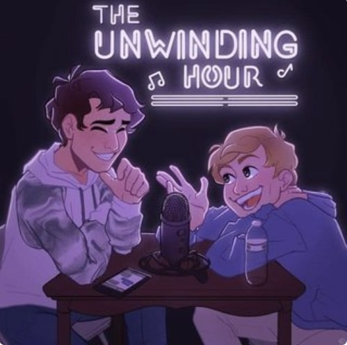 Select Appropriate Typography
Not all fonts are created equal. When shrunken down, some might be rendered illegible. Also, using more than one font can be distracting. Choose clean, easy to read fonts – no more than two; one serif and one sans-serif.- Go With Fewer Words
You might feel inclined to include every word that fits what you’re trying to describe, but you’ll quickly come to see that the cover art is small. Anything over 5 words tends to look crowded and can be hard to read.
- Ensure Your Subject Comes Through
There is a massive variety of podcasts out there, so spend the time crafting cover art that reflects the type of podcast you have. Is it about hobbies? Business, brand or religious institution promotion? Personal? Pro-tip: Seek out what your competition is doing and notice what their art direction approach is.
After Designing:
- Establish Where Your Podcast Cover Will Be Used
Not only will your podcast cover art be used in s podcast directory and other outlets, but think of all the opportunities you have to show it off via social media accounts, email signatures, business cards and more. Versatility is what will get you seen and remembered.
- Be Visually Consistent
As your podcast is making the rounds across social media, ensure your imagery is consistent. Same colors, same imagery and same type. This way, you reinforce your brand presence and create harmony for people to recognize you.
- Use Your Artwork Everywhere
Design your podcast cover art with other mediums and their respective sizes in mind so you can “cross-pollinate.” You might have to tweak it here and there, but utilize most of the design elements so you’re still recognizable no matter where you’re featured.
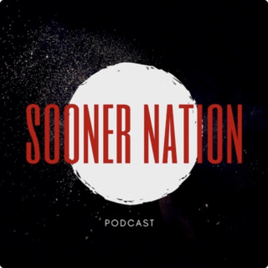 Get Marketing
Now that your podcast is recorded and edited, polished and ready to go, use your podcast artwork to make a splash. Feature it on your website, social media and live stream to YouTube for maximum exposure.
Trust TalkShoe to provide you the tools and support you need to host, produce and store a knockout podcast. Create professional-sounding episodes and experience what it’s like to broaden your audience with the analytics tools that bolster your reach. Plus, with TalkShoe’s virtual recording studio, you can produce high quality content that listeners from near and far want to listen to.
It’s easy to record a podcast with guests remotely anywhere they are, no matter where you are. Learn more about TalkShoe here.
 Understand Restrictions And Requirements
 Select Appropriate Typography
 Get Marketing